About the project
Lehtosen Timo is my personal brand, reflecting my creative persona and expertise in UX design and accessibility. Key brand values include approachability, creativity, expertise, and a warm, humorous tone. The name comes from my first and last names, phrased in a relaxed, familiar Finnish style, further emphasizing these values.
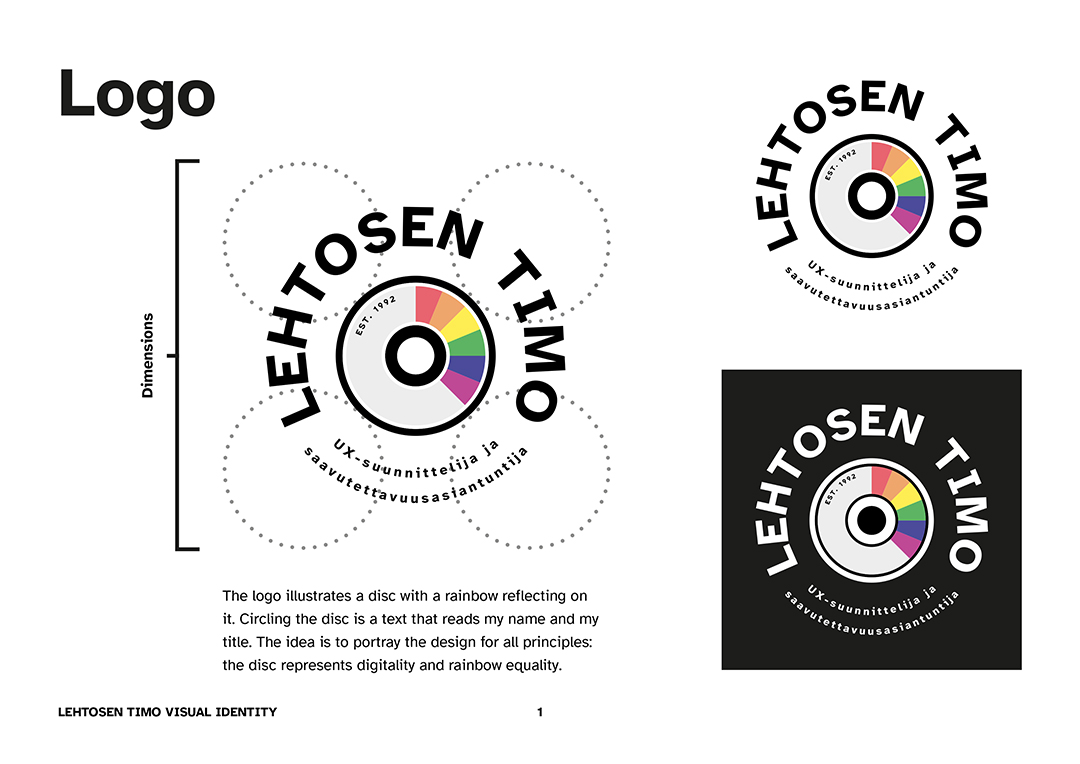
The logo features a CD with a rainbow reflecting across it. The disc represents digitality and inclusivity—core values of my work. The rainbow stands for diversity and equality, while the CD symbolizes modern technology and digital media. The brand name and job title surround the CD, reinforcing the accessibility-focused ethos. This emblem captures my "design for all" philosophy, using technology to create inclusive solutions.
Core Design Elements
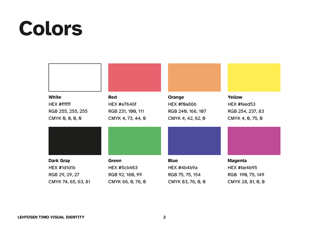
Colours
The vibrant palette, inspired by the rainbow, signifies diversity and equality. These colours contrast with dark and light backgrounds for high readability and accessibility.
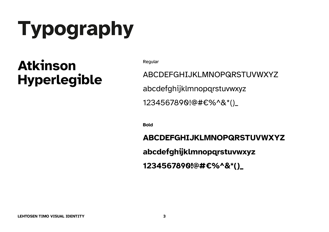
Typography
The Atkinson Hyperlegible font family is used throughout. Designed for accessibility, it ensures clarity and legibility, especially for users with visual impairments.